
AI art styles are shorthand visual constraints, covering medium, texture, lighting, and palette, that steer an image model toward a specific look instead of a generic default. This guide organizes them into five families, lists dozens of named styles with one-line visual traits, and hands you copy-ready prompt starters plus a workflow for keeping results consistent across multiple images.
TL;DR:
- Using specific medium language like watercolor or oil painting ensures the AI accurately reproduces surface texture, light behavior, and physical effects.
- Traditional media styles create handcrafted feels through unique brushstrokes, pigment behavior, and paper textures, ideal for warmth or tactile aesthetics.
- Photorealism relies on detailed camera and lighting terms such as lens, depth of field, and film cues to achieve believable realism, not resolution tags.
- Digital and game styles depend on surface finishes, geometry, and explicit constraints like facet count or palette size to prevent defaulting to generic 3D renders.
- Combining styles requires presenting subject, medium, lighting, and palette separately, with explicit ratios or layered instructions to avoid drifting toward one dominant look.
Table of Contents
- What Are AI Art Styles, and How Do the Five Families Work?
- Traditional Painting and Drawing Styles With Starter Prompts
- Photography and Cinematic Styles: Getting Convincing Realism
- Digital and 3D/Game Styles With Prompts
- Illustration and Print Styles for Branding and Editorial Work
- Pop-Culture and Hybrid Aesthetics: Getting Genre-Faithful Results
- How to Combine Styles Without the Output Drifting Generic
- A Prompt-Writing Checklist and Templates You Can Reuse
- Iterating Across Images Without Losing Consistency
- Why Trust This Guide’s Approach to Style and Prompting
- Building Your Own Style Vocabulary Is the Real Skill
- Where Vision Forge, Mind Spark, and Flow Engine Fit Into Your Workflow
- Sources
- FAQ
What Are AI Art Styles, and How Do the Five Families Work?
A style name is really a bundle of instructions. When you type “watercolor,” you are not naming an aesthetic category so much as telling the model to render soft gradients, visible paper texture, and pigment that pools at wet edges. Say “oil painting” instead, and you’re asking for thick ridges of paint, visible brushwork, and a glossier surface catching light differently. The words matter because they control texture, color palette, lighting behavior, and composition all at once.
That is why vague style labels produce vague results. A prompt that just says “make it artistic” gives the model nothing concrete to grab onto, so it defaults to whatever look shows up most often in its training data, usually a flat, over-polished digital illustration. Specific medium language fixes that by telling the model how surfaces should physically behave.
Guides on AI aesthetics commonly sort the huge range of possible looks into five working families, which is a useful map before you start prompting:
- Traditional media — watercolor, oil painting, charcoal, ink line art, gouache, pastel, and other physical-material looks.
- Photographic and film — realistic photography, cinematic color grading, vintage film stock, and lens-driven effects.
- Digital and game aesthetics — 3D render, low-poly, pixel art, vector game art, and other computer-native looks.
- Illustration and print — risograph, collage, screen print, papercraft, and other reproducible graphic styles.
- Pop-culture and hybrid aesthetics — anime, cyberpunk, art deco, retro-futurism, and genre mashups.
Style guides that catalog more than 70 named styles tend to group them exactly this way, because the grouping mirrors how the underlying visual mechanics actually differ. Traditional media is about physical material behavior. Photography is about optics and light capture. Digital and game styles are about rendering engines and pixel grids. Illustration and print is about reproducible mark-making. Pop-culture styles borrow era and genre cues rather than a single medium.
Once you know which family you’re in, picking the right words gets much faster. You stop guessing at adjectives and start asking a narrower question: what does this specific medium do to light, edges, and texture that I need to name out loud?
Traditional Painting and Drawing Styles With Starter Prompts
Traditional media styles read as handmade because they carry the physical fingerprints of the tools involved: bristle marks, pigment bleed, paper grain. Naming those fingerprints, rather than just the medium, is what gets a model to reproduce them convincingly.
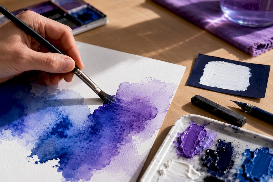
Watercolor shows soft gradients and wet edges where pigment blooms outward before drying, leaving pale halos around darker strokes. It works well for gentle backgrounds, botanical illustration, and portraits that need a delicate, unfinished quality.
Starter prompt: “A quiet lakeside cabin at dawn, watercolor painting, wet-edge blooms where pigment meets paper, soft color gradients, visible cold-press paper texture, loose and unblended brushwork.”
Oil painting carries thick, textured brushstrokes with visible ridges of pigment (impasto) that catch light differently depending on the angle, plus a glossy sheen where paint has pooled. It suits portraits, still life, and any scene that benefits from rich, layered color.
Starter prompt: “A still life of ripe pears on a wooden table, oil painting, thick impasto brushstrokes catching side light, visible canvas weave beneath thin glazes, warm varnished sheen.”
Charcoal drawing gives you smudged gray tones, sharp black accents where the stick was pressed hard, and a rough paper tooth visible through lighter passages. It fits moody portraits, architectural studies, and any concept sketch that needs weight without color.
Starter prompt: “Portrait of an elderly fisherman, charcoal drawing, smudged mid-tones, sharp cross-hatched shadows, visible paper tooth, heavy black accents around the eyes.”
Ink line art relies on clean, confident line weight that varies from thick to thin, often with cross-hatching for shading instead of gradients. It’s the natural choice for comic panels, technical illustration, and tattoo-style designs.
Starter prompt: “A coiled dragon wrapped around a lantern, ink line art, varying line weight, dense cross-hatching for shadow, no color, high-contrast black on white.”
Gouache looks flatter and more opaque than watercolor, with a matte, chalky finish and crisp edges between color blocks rather than soft blends. It works especially well for editorial illustration and mid-century-style posters.
Starter prompt: “A retro travel poster of a coastal village, gouache painting, flat opaque color blocks, matte chalky finish, crisp hard edges, limited five-color palette.”
Reach for traditional media styles when the goal is warmth, texture, or an obviously handmade feel, and skip them when a client needs something that reads as sleek or corporate.
Photography and Cinematic Styles: Getting Convincing Realism
Photorealism lives or dies on camera vocabulary, not resolution tags. Prompts describing lens behavior, lighting, and composition produce more convincing realism than generic quality markers, because “8K” tells a model almost nothing about how a scene should actually look, while “shallow depth of field” or “golden hour rim light” describes a physical effect it can render.
A handful of camera terms do most of the heavy lifting:
- Lens feel: “85mm portrait lens” compresses background and flatters faces; “24mm wide angle” exaggerates depth and distorts edges.
- Aperture feel: “shallow depth of field, f/1.8” blurs backgrounds into soft bokeh; “deep focus, f/11” keeps everything sharp.
- Framing: “rule-of-thirds composition,” “low-angle shot,” or “over-the-shoulder framing” all change the story a photo tells.
- Lighting: “golden hour side light,” “overcast soft light,” or “hard studio flash” each produce a distinct mood.
- Film stock cues: “Kodachrome-style color shift” or “16mm film grain” add period texture and imperfection that pure digital renders lack.
Pro Tip: Swap “8K, ultra detailed” for one real camera phrase, like “shot on 50mm lens, natural window light,” and you’ll often get a more believable image than stacking five vague quality tags.
A working photorealism template looks like this: “A street vendor selling fruit at a morning market, shot on 35mm lens, natural overcast light, shallow depth of field, candid documentary framing, visible skin texture and fabric weave.” Notice there’s no mention of resolution at all. The realism comes from optics and light description, not a technical spec that the model can’t meaningfully interpret as a visual instruction.
Cinematic prompts add one more layer: color grading. “Teal and orange grade,” “desaturated with lifted blacks,” and “high-contrast noir lighting” each borrow a specific film look. Combine a lens term with a grading term and a lighting term, and you’ve described a shot the way a cinematographer actually would, which is exactly the level of specificity these models respond to best.
Digital and 3D/Game Styles With Prompts
Digital and game aesthetics run on rendering logic rather than physical material, so the vocabulary that works here is about surface finish, geometry, and grid constraints instead of brushwork.
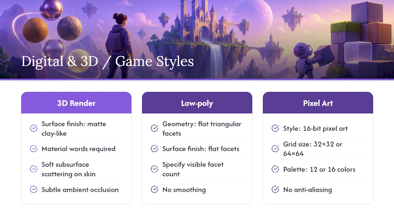
3D render styles need explicit material words to avoid the generic “plastic toy” look that under-specified prompts tend to produce. “Matte clay-like surface,” “brushed metal with subtle scratches,” or “soft subsurface scattering on skin” each push the render engine toward a distinct finish.
Starter prompt: “A stylized fox character, 3D render, matte clay-like surface, soft studio lighting, subtle ambient occlusion in the fur creases, pastel color palette.”
Low-poly art depends on faceting, not texture. You need to tell the model how many surfaces you want visible: “geometric low-poly render, flat triangular facets, no smoothing, faceted lighting on each polygon face.” Without that facet language, the model tends to soften edges back toward a rounded, generic 3D look.
Starter prompt: “A low-poly mountain landscape at sunset, flat triangular facets, no gradient smoothing, warm orange and purple flat-shaded lighting, minimalist geometric style.”
Pixel art is the one style family where numbers genuinely matter. Specify a grid size and a palette count, or the model will default to something far more detailed than true pixel art ever looks: “16-bit pixel art, 32 by 32 pixel grid, 16 color palette, no anti-aliasing, hard pixel edges.”
Starter prompt: “A tiny cottage with a smoking chimney, 16 bit pixel art, 64 by 64 grid, 12 color limited palette, hard-edged pixels, no dithering.”
These styles fit specific jobs well: app icons and UI elements lean on flat digital or low-poly looks, product concept renders lean on 3D material language, and pixel art covers retro game assets and small social icons where a limited palette actually reads as intentional rather than low effort.
Illustration and Print Styles for Branding and Editorial Work
Print-oriented styles are defined by production constraints as much as visual taste. Real risograph printing, screen printing, and papercraft all involve physical limitations, and naming those limitations in your prompt is what makes the AI output look authentically reproducible instead of just decorative.
Risograph printing layers a small number of flat spot colors with visible misregistration between layers and a grainy, slightly inconsistent ink texture. Describe it as: “risograph print style, two-color layered print, fluorescent pink and navy blue, visible print grain, slight color misregistration, halftone texture in shadows.”
Halftone and limited palette work goes hand in hand with print styles generally. Naming a specific palette count (“three-color palette,” “duotone in orange and black”) keeps the model from drifting toward full-color photorealism, which is the most common failure mode when print-style prompts are left too open-ended.
Collage and papercraft styles rely on layered cut-paper shadows and visible edges. “Paper cutout collage, layered construction paper shapes, visible drop shadows between layers, slightly uneven paper edges, matte cardstock texture” tells the model exactly how depth should read, through cast shadow rather than gradient shading.
Useful prompt templates for this family:
- Risograph poster: “A concert poster for a jazz trio, risograph print, two-color layered ink in teal and coral, visible print grain, bold flat typography shapes, slight registration offset.”
- Papercraft scene: “A layered paper diorama of a forest at night, cut-paper collage, visible drop shadows between layers, matte textured cardstock, warm backlit glow behind the trees.”
- Screen-print branding asset: “A logo mark of a mountain range, screen print style, flat two-color ink, slight ink texture at the edges, no gradients.”
Reach for this family whenever the final output needs to look plausible as something that could actually be printed: posters, book covers, packaging mockups, and editorial spot illustrations all benefit from naming the production method rather than just the drawing style.
Pop-Culture and Hybrid Aesthetics: Getting Genre-Faithful Results
Genre styles like anime, cyberpunk, art deco, and retro-futurism work best when you combine three things in one prompt: an era, a color palette, and a surface finish. Naming just “anime style” or “cyberpunk” leaves a lot of room for the model to guess, and it often guesses toward the most generic, overused version of that genre.
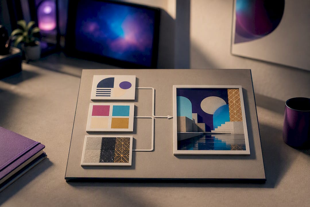
A stronger pattern looks like era plus palette plus finish. For anime background art, that might be: “1990s anime background art, painted matte backgrounds, muted teal and cream color palette, soft cel-shaded lighting, hand-painted texture visible in the sky gradient.” Naming the decade changes the result dramatically, since 1990s anime backgrounds look nothing like the flatter, more saturated style common in current streaming anime.
For cyberpunk cityscapes, try: “cyberpunk city street at night, neon signage in magenta and cyan, wet reflective pavement, dense layered signage, hazy atmospheric fog, retro-futuristic 1980s influence.” That last clause, tying it to 1980s design sensibility rather than a generic “futuristic” label, pulls the result toward the genre’s actual visual roots instead of a modern sci-fi default.
Art deco benefits from the same treatment: “art deco poster design, geometric sunburst patterns, gold and black color scheme, symmetrical ornamental borders, 1920s luxury advertising style.” Retro-futurism works similarly: “1960s retro-futurist illustration, atomic-age design motifs, pastel and chrome color palette, optimistic space-age imagery.”
One important guardrail here: describe genre and era rather than naming a living artist whose work you want to imitate. Genre descriptors like “1990s anime,” “1980s cyberpunk,” or “atomic-age retro-futurism” give the model plenty to work with, and they sidestep the ethical gray area of asking a system to copy one identifiable person’s signature style.
How to Combine Styles Without the Output Drifting Generic
Mixing two styles, like “watercolor made of porcelain” or “cyberpunk risograph poster,” is where most prompts fall apart, because the model has to reconcile two different sets of physical rules and will often default back toward whichever look is most common in its training data. A predictable prompt structure fixes most of that drift.
- State the subject first. What is actually in the frame, stated plainly, with no style language yet.
- Name the style or medium second. This is where you declare which physical rules apply, and if you’re combining two, name both explicitly rather than implying a blend.
- Add lighting third. Lighting behavior often differs sharply between styles, so specify it after the medium is locked in.
- Specify palette fourth. A named color scheme keeps both styles from muddying into brown or gray, which is the most common failure when two saturated palettes fight each other.
- Add hard constraints last. Phrases like “no extra background elements,” “flat color, no gradients,” or “16 color palette maximum” tell the model what to leave out, not just what to include.
For a genuinely hybrid look like “watercolor made of porcelain,” phrase it as two layered material instructions rather than one blended adjective: “a teacup rendered as if made of watercolor pigment on porcelain, soft pigment bleed at the rim following the ceramic curve, glossy glazed highlight, wet-edge bloom constrained to the surface of the object only.” That last clause is doing real work. It tells the model the watercolor behavior applies to the object’s surface, not the whole image, which is usually what people actually mean by a phrase like that.
Pro Tip: When a hybrid prompt keeps drifting toward one style and ignoring the other, add an explicit ratio cue like “60% risograph print texture, 40% cyberpunk neon lighting” — it’s a blunt instrument, but it works more reliably than hoping the model balances both on its own.
Numeric and hard constraints matter more than most people expect for pixel, print, and grid-based styles specifically, since layering material and texture description with explicit numeric rules is what keeps those styles from sliding back toward a generic, overly smooth default render.
A Prompt-Writing Checklist and Templates You Can Reuse
Reliable style control comes down to working through the same short checklist every time, rather than improvising a fresh prompt structure for each new image. Before you generate anything, run through these:
- Subject and use — what’s in the frame, and what is this image actually for (social post, print, product mockup)?
- Family — traditional media, photographic, digital/game, illustration/print, or pop-culture?
- Medium behavior — what does this specific material physically do to light and edges?
- Lighting — direction, hardness, and color temperature of the light source.
- Composition — framing, angle, and rule-of-thirds or centered subject placement.
- Palette — named colors or a color count, not just “colorful” or “muted.”
- Quality levers — camera terms for photoreal work, grid size for pixel art, facet count for low-poly.
- Constraints — what to explicitly exclude or hold fixed.
That order mirrors how structured image-prompting guidance recommends organizing a prompt: scene, subject, details, and constraints, refined one attribute at a time rather than all at once.
Three templates worth keeping on hand:
Photoreal portrait: “A portrait of a young chef in a professional kitchen, shot on 85mm lens, natural window light from the left, shallow depth of field, candid expression, visible fabric texture on the apron, no text or logos.”
Product photo: “A ceramic coffee mug on a marble countertop, studio softbox lighting from above, matte ceramic finish with subtle glaze reflections, shallow depth of field, clean neutral background, no props.”
Stylized poster: “A festival poster for a summer music event, risograph print style, two-color layered ink in orange and navy, bold geometric typography shapes, visible print grain, no photographic elements.”
Change one variable at a time between attempts, whether that’s swapping the lighting term or the palette, rather than rewriting the whole prompt. That approach is exactly what makes the checklist worth using in the first place: it turns trial and error into a controlled experiment where you can actually tell which word caused which change.
Iterating Across Images Without Losing Consistency
Keeping a character, product, or scene consistent across multiple generated images is one of the harder practical problems in AI art, and the fix is a repeatable loop rather than a single clever prompt.
- Generate a baseline image using your full checklist prompt, and treat it as the reference, not the final answer.
- Inspect it critically for anything off, whether that’s a texture that reads wrong or a color that’s drifted from what you wanted.
- Change one attribute at a time in your next prompt, such as lighting or pose, while explicitly restating what should stay the same: identity, geometry, and material.
- Use multi-image inputs when the tool supports them, feeding a previous result back in as a reference so the model has something concrete to anchor to rather than reinterpreting your text prompt from scratch each time.
- Regenerate and compare side by side before moving to the next attribute.
That explicit separation between what changes and what stays fixed is exactly what production prompting workflows recommend: naming invariants like identity, geometry, and lighting keeps a model from quietly redesigning your subject every time you ask for a small edit.
On quality settings, save the highest setting for images with dense in-image text, fine linework, or a final client-facing deliverable. Lower or standard settings are usually fine for early exploration passes, where you’re still testing which style direction to commit to and speed matters more than pixel-perfect output.
Why Trust This Guide’s Approach to Style and Prompting
This guide leans on published prompting documentation and vendor guides rather than guesswork, drawing on structured style catalogs, camera-language recommendations for photorealism, and cookbook guidance on multi-image workflows and invariant-based editing. The goal throughout has been describing physical medium behavior, how watercolor blooms, how impasto catches light, rather than handing you vague style labels that leave a model guessing.
One legal note worth taking seriously: as of July 2026, fully AI-generated images created without meaningful human authorship generally do not qualify for independent copyright protection in the United States. If you’re registering a work that blends human-authored elements with AI-generated ones, federal copyright guidance requires disclosing the AI contribution, and failing to disclose can lead to cancellation of the registration entirely. That matters most for commercial and editorial work where ownership needs to be airtight, less so for personal experimentation or social content.
Building Your Own Style Vocabulary Is the Real Skill
The biggest misconception about AI art styles is that picking the right label is the hard part. It isn’t. The hard part is learning to describe physical behavior, what a surface does to light, how an edge blurs or stays crisp, and that skill transfers across every model you’ll ever use, regardless of which one is popular next year.
Treat your first dozen prompts on any new style as an experiment, not a final answer. Change one variable, watch what shifts, and keep a running note of which words actually moved the needle for you. That personal vocabulary becomes more valuable than any style list, including this one.
The one place we’d urge real caution is around named artists and copyrighted reference material. Genre and era descriptors get you 90% of the way to a distinctive look without wading into the ethical mess of imitating one living person’s signature style. Build your vocabulary around materials, light, and era instead, and you’ll end up with results that are both more original and easier to stand behind.
— Magical
Where Vision Forge, Mind Spark, and Flow Engine Fit Into Your Workflow
The platform is designed to support an iterate-one-attribute-at-a-time workflow as described in this guide, integrating tools for generating, refining, and tracking prompt history.
Vision Forge handles the image generation side, built to respond to the kind of specific, layered prompts covered above, whether you’re anchoring a character across a series or testing palette variations on a product shot. Mind Spark and Flow Engine cover the writing and concept side, useful when you’re drafting the narrative description behind a prompt or developing a broader creative brief before a single image gets generated. Together they cut down the back-and-forth of switching apps mid-project, which matters most when you’re deep in an iteration loop and don’t want to lose track of which attribute you already changed.
Vision Forge starts from $9 a month, Mind Spark from $12, and Flow Engine from $15, all available through the Magicalworldofai AI tools page. If you’ve got a style you want to test, the fastest next step is picking one prompt template from this guide and running it through Vision Forge to see how it handles your specific combination.
Sources
FAQ
Is there an NSFW AI image editor available?
Most mainstream AI image tools, including Magicalworldofai’s Vision Forge, apply content policies that block explicit or NSFW output, and that’s standard across the major generation platforms. If you’re looking for guidance on prompt structure for any style within those content policies, the beginner prompt guide covers the fundamentals that apply across all use cases.
What are the seven different types of art?
Art is traditionally divided into categories like painting, sculpture, architecture, literature, music, film, and theater, though this classic list predates digital and AI-generated work entirely. For AI art specifically, the more useful breakdown is the five style families covered in this guide: traditional media, photography, digital/game, illustration/print, and pop-culture aesthetics.
What art styles can ChatGPT do?
ChatGPT’s image generation can produce styles across all five major families, from watercolor and oil painting to photorealism, pixel art, low-poly 3D, risograph print looks, and anime or cyberpunk aesthetics. Results depend heavily on how specifically you describe medium behavior, lighting, and palette rather than just naming a style in one word.
What are some good AI art style prompts?
Strong prompts name the subject first, then the medium’s physical behavior, then lighting and palette, and finally any hard constraints on what to exclude. An example: “a fox in a garden, watercolor painting, wet-edge blooms at the fur’s outline, soft morning backlight, muted green and gold palette, no background clutter.”
How do I keep a character consistent across multiple AI-generated images?
The most reliable method is feeding a prior image back in as a reference when your tool supports multi-image input, then changing only one attribute at a time while explicitly stating what should stay fixed, like identity, geometry, and lighting. Tools like Mind Spark and Flow Engine can also help track the prompt history behind each iteration, so you’re not reconstructing your reasoning from scratch on the fifth revision.